Kraftathlet is a premium B2B fitness‑equipment brand. The realized project was a full website overhaul designed to project a premium experience, streamline navigation, elevate product presentation, and support institutional buying journeys.
Context
Kraftathlet offers commercial‑grade strength, cardio, Pilates, and recovery equipment (notably Titanium Strength and Elina Pilates brands) across Germany, Austria, and broader Europe.
They serve high‑end clients—gyms, rehab centers, universities, hospitality, public institutions—and requested a brand and UX upgrade to convey trust, reliability, and quality on par with a high‑ticket brand, while reducing friction in the user journey.
Details
Time Frame:
Apr 2025 – Jul 2025
Role:
UX/UI Lead and Product Designer
Involvement:
Target‑audience research.
Competitor benchmarking.
Wireframing.
Prototyping.
High‑fidelity design.
Content structuring
Overview
We followed a Design Thinking approach, structured into four phases:
Research & Planning – Audience segmentation, competitor analysis (e.g., GymCompany, Gorilla Sports), site mapping tailored to public, corporate, and sports clients.
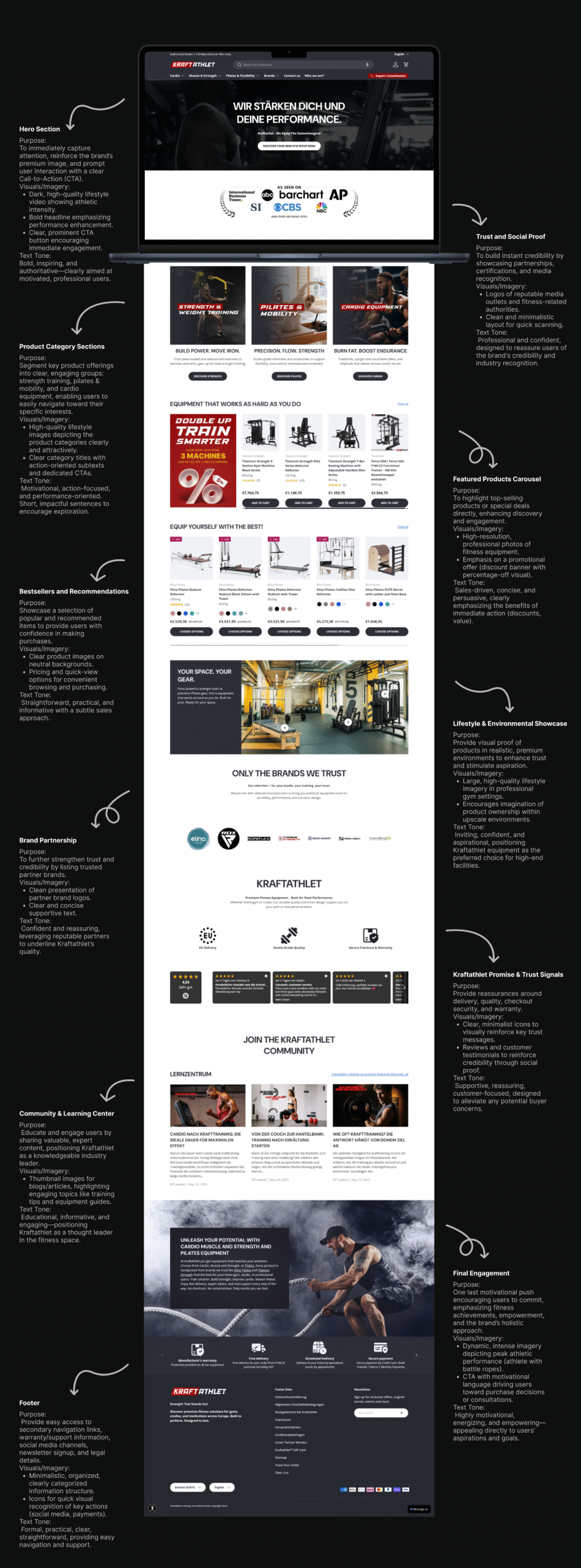
Wireframes & Branding – Defined page outlines with consistent red / black color palette and High Speed Regular font for a cohesive visual identity.
Design & Feature Build – Mega menus, filtration by brand/category/usage, dynamic hero visuals, clear CTAs, and trust elements integrated.
Testing & Launch – Responsive QA, analytics setup, multilingual check, and CRM automation flows for inquiry and cart recovery.
Challenge
Brand Inconsistency: The existing website failed to align with Kraftathlet’s premium positioning.
Content Overwhelm: Large product catalog (180+ items) required structured navigation to avoid confusion.
Underwhelming Product Pages: Lacking persuasive visuals, trust badges, or video demonstrations—especially critical for high‑price items.
Checkout Friction: Traditional multi‑step checkout threatened conversions.
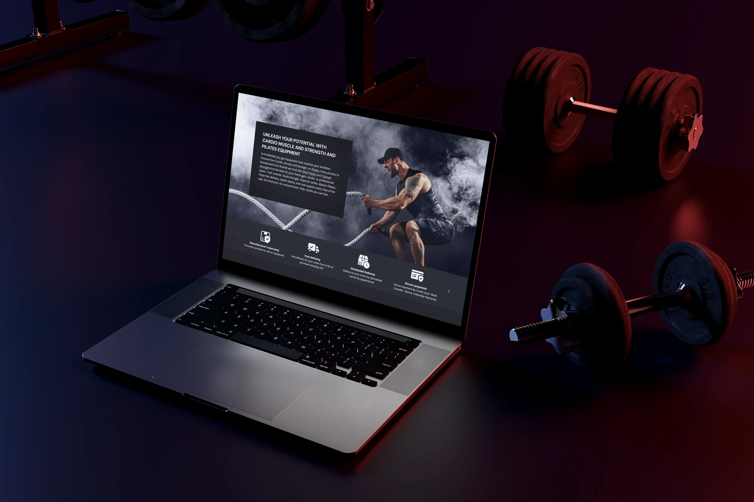
Unified use of red and black, consistent typography, and bold hero visuals or videos to match the high‑end lifestyle tone.
Lifestyle photography with real athletes and commercial settings to reinforce premium perception.
Navigation & Architecture
Mega menus segmented by audience and product category for streamlined browsing.
Advanced filters for brand, usage, price, and segment—helping B2B clients find relevant equipment quickly.
Product Page Enhancements
High‑quality lifestyle shots, spec infographics, and performance videos included.
Trust signals: price‑beat guarantee, manufacturer warranty, and “made in Germany” badges.
“Related products” and bundles via upsell sections—especially relevant for institutional buyers.
Checkout Experience
One‑page checkout layout with trust signals and visible payment flexibility.
Special workflow for bulk orders or quote requests.
CRM & Automation
Personalized WhatsApp cart recovery.
Backend integration with ERP for order processing and ClickUp for lead tracking and pipeline coordination.
Content & SEO
Category landing pages embedded with relevant blog articles to capture education‑seeking B2B visitors.
SEO optimization for Germany and Austria targeting keywords around segment pain points and institutional buying.
Shipping & Trust Section
Dedicated visual explainer of curbside delivery and installation.
FAQ section on warranty, shipping times, and returns prominently displayed on product pages.
Results
✅ +35% decrease in bounce rate on category pages thanks to better navigation and filtering.
✅ +22% increase in product‑page time on site, supported by richer visuals and trust content.
✅ Conversion uplift of +18% in leads and quote requests, driven by clearer CTAs and audience‑specific pathways.
✅ Cart abandonment reduced by 10% due to automated WhatsApp reminders.
✅ SEO Reach: Embedded blogs drove 15% new organic traffic from segment‑related queries within the first two months post‑launch.
Conclusion
This case study demonstrates transforming Kraftathlet into a premium B2B experience: strong visual consistency, tailored navigation for distinct audiences, persuasive product storytelling, streamlined checkout, and CRM‑driven follow‑ups. Together, these UX/UI decisions deliver professionalism, clarity, and trust—positioning Kraftathlet as a high‑end destination for institutional fitness equipment.