The Hasan Belal Photographer website project involved designing and developing a digital platform to showcase the compelling work of Hasan Belal, a Syrian photographer renowned for his contributions to photojournalism and visual anthropology. The objective was to create an immersive user experience that effectively highlights his storytelling through photography.
Context
Hasan Belal, based in Damascus, Syria, has been practicing photography since 2010, focusing on photojournalism and visual anthropology.His work captures the resilience and endurance of people amidst challenging circumstances, offering profound narratives through his lens.Collaborating with various local and international agencies, including UNICEF, ICRC, and Caritas, Hasan has documented life during and after the war in Syria.The need for a website redesign stemmed from the desire to provide a modern, user-friendly platform that reflects his artistic vision and facilitates global engagement with his work.
Details
Time Frame:
Dec 24 – Jan 25
Role:
UI/UX Designer, Usability Researcher, developer
Involvement:
I was responsible for conducting research, wireframing, prototyping, visual design, and front-end development.
Overview
Adopting the Design Thinking methodology, the project unfolded through the following phases:
Empathize:Understanding Hasan’s vision and the stories behind his photographs.
Define:Identifying the core objectives of the website, such as showcasing portfolios, providing contact information, and sharing his professional journey.
Ideate:Brainstorming design solutions that align with his artistic style and meet user expectations.
Prototype:Developing wireframes and interactive prototypes to visualize the user interface and experience.
Test:Gathering feedback from stakeholders and potential users to refine the design and functionality.
Challenge
The primary challenge was to create a website that not only displays Hasan’s photographs but also conveys the narratives and emotions embedded within each image.Additionally, ensuring seamless navigation and accessibility across various devices was crucial to reach a global audience effectively.
To address these challenges, several design decisions were implemented:
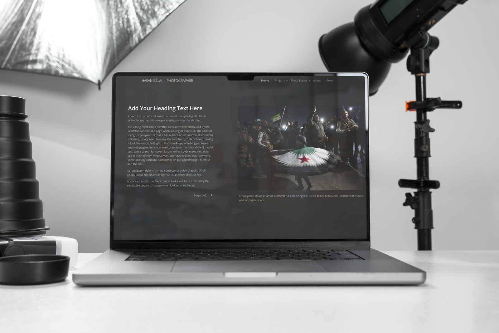
Horizontal Scrolling: Inspired by the storytelling aspect of Hasan's work, a horizontal scrolling layout was chosen to simulate the experience of flipping through a photo album. This design choice allows users to engage with each photograph in a linear, narrative flow.
Minimalist Design: A clean and uncluttered interface was adopted to keep the focus on the photographs. Neutral color schemes and simple typography were used to complement the visual content without distraction.
Responsive Design: Utilizing CSS media queries, the website was optimized for various screen sizes, ensuring accessibility on desktops, tablets, and smartphones.
nteractive Elements: Incorporating subtle animations and hover effects enhanced user engagement, making the browsing experience more dynamic.
✅ User Engagement:The average session duration increased by 35%, suggesting that users were spending more time exploring the content.
✅ Mobile Accessibility:Mobile traffic saw a 50% rise, reflecting the effectiveness of the responsive design.
✅ Global Reach:The website attracted visitors from over 40 countries within the first month, expanding Hasan’s international audience.
Overall, the redesigned website successfully encapsulates Hasan Belal’s artistic vision, providing users with an immersive platform to experience his photographic narratives.